
Bitcoin Exchange Reserves: Two Data Providers, Two Very Different Numbers, One Labeling Problem
"BTC on exchanges is at multi-year lows" is true or false depending on whose address labels you are reading. Coin Metrics has the reserve about 13.3% of supply and rising through 2023 and 2024; Santiment has it at 6.6% and at lows since 2017. Neither is lying. Both are counting a dataset, not Bitcoin.
The gap between those two figures is the whole story, and it comes before any question about what the flows mean. Exchange netflow and reserves are the most quoted on-chain metrics and the least often footnoted: every chart of them rests on a list of addresses somebody decided belong to an exchange, and that list is incomplete by its own authors' admission. This piece works from the series we actually use in the Score, dates every number, splits the two things the metric conflates (a daily flow and a slow-moving stock), and closes with the outflows that preceded nothing.
What the source counts, in its own words
Our series comes from the Coin Metrics Community API, free and keyless: SplyExNtv (BTC in exchange-labeled addresses), FlowInExNtv and FlowOutExNtv, daily since 2011. This is not own-node data. A full, non-pruned Bitcoin Core knows the balance of every address and has no idea who controls any of them, and "who" is the entire question here.
Coin Metrics' documentation defines the reserve as the balance of every address it has flagged as exchange-controlled, hot and cold wallets both, "even if our coverage of the exchange is not complete," and states that the metric "should be seen as an underestimation of the actual figure, as our heuristics and sources might not discover all addresses owned by an exchange." The flow metrics exclude exchange-to-exchange activity by design, so 90 BTC moving from one labeled exchange to another counts as neither inflow nor outflow. Correct, and it means both ends of a transfer must be labeled for the netting to work. In its October 2024 State of the Network, Coin Metrics put its per-exchange flow coverage at about twenty venues. Every venue not on that list, and every fresh wallet of one that is, shows up as a phantom outflow until the label catches up.
The numbers, dated
Per Coin Metrics, as of October 7, 2026, exchange-labeled addresses held 2,663,370 BTC, 16.1% below the all-series peak of 3,175,540 BTC on July 27, 2021, a drop of 512,170 BTC over five years. The year's low was April 25, 2026, at 2,561,260 BTC, a level this series had not printed since May 2019.
The path down is not monotonic, and that matters for the "structural decline since 2020" framing that circulates. In this same series the reserve rose 3.3% during 2023 and 1.6% during 2024, the year U.S. spot ETFs launched, and printed 3,092,360 BTC on November 5, 2024. The steep leg is 2025, down 9.2% on the year; 2026 so far has been a round trip, down to that April low and most of the way back, leaving the reserve on October 7 just 0.4% below its 2025 close. Anyone describing an uninterrupted five-year drain is reading a different provider's labels.
Two opposite extremes, 24 hours apart
The largest daily net outflow since 2019 came on November 17, 2022, six days after FTX filed: 88,120 BTC out against 35,801 in, net -52,318 BTC. The next day, November 18, the same series prints the largest daily net inflow of the period, +88,036 BTC. Two opposite extremes inside 24 hours do not describe a collective change of mind; they describe exchanges shuffling their own wallets under stress. Across the full month of November 2022 the cumulative netflow was -169,286 BTC and the reserve fell by 170,630 BTC. The two nearly match, which is the minimum a series has to pass before anyone reads meaning into it.
Netflow and balance trend are two indicators in the Score, deliberately
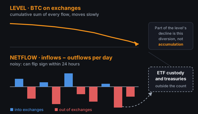
The Cycle Score carries this family as two separate inputs. exchange_flows is the 30-day smoothed netflow: the recent pulse, whether more BTC moved into or out of labeled exchanges over the past month. accumulation_trend is the change in the reserve level over a 90-day window: the structural shift in the stock, not the day's movement.
The reason to keep them apart is in the figures above. Daily netflow can swing from -52,000 to +88,000 BTC overnight; the level, the cumulative sum of all those flows, has not moved more than 13% in any 90-day window since 2019, with the December 2022 trough (-11.5%) and the January 2019 build (+12.8%) as its two extremes. A single blended input would let one noisy week bury a three-month trend, or the reverse. Where each one's thresholds sit and how much each weighs is part of what we keep reserved, for the reasons the pillar lays out; the public check on whether the combination has worked is the Score's backtest, not our say-so.
What gets read, and what skews it
| The usual reading | What may be skewing it |
|---|---|
| "BTC is leaving exchanges: investors are accumulating" | Part of the outflow lands with ETF custodians and corporate treasuries; shareholders can sell in equity markets without a satoshi moving |
| "Reserves are at record lows" | Provider-dependent: Coin Metrics counts only what it has labeled and calls the result an underestimate; an unlabeled new hot wallet registers as an outflow |
| "A big inflow means sell pressure is coming" | An exchange consolidating its own wallets produces the identical spike; November 17 and 18, 2022 are the worked example |
| "The level has fallen for years, it's structural" | In Coin Metrics' series it rose in 2023 and 2024; the sharp decline is concentrated in 2025, with 2026 roughly flat |
None of these rows says the metric is useless. Each says the standard reading carries a named bias, and the bias is not fixed by staring harder at the chart but by knowing which addresses are inside the count and which are not.
Custody, and why the two providers cannot agree
Spot ETFs buy bitcoin and park it with custodians such as Coinbase Custody, Fidelity Digital Assets or BitGo. To a provider's label set those addresses are not exchanges, so coins entering them have "left" the system. To the market, that bitcoin is as sellable as anything still sitting on Binance: a shareholder sells in the equity market and the issuer redeems, with no on-chain movement required that day. It is the same custody bias we already declare on Supply & Holders for the large cohorts and in the pillar's "What the Score Does Not Measure" section, applied here to flows.
The size of the labeling gap is directly measurable. CoinDesk reported in July 2026, citing Santiment, that BTC on exchanges stood at 6.6% of circulating supply, the lowest since 2017; the same piece put U.S. spot ETF holdings above 641,400 BTC, per Coinglass. Coin Metrics' 2,663,370 BTC as of October 7, 2026 is roughly 13.3% of issued supply at that date. Same public chain, one number double the other, and the difference is nothing but which addresses each firm has managed to attribute. A "record low" in one dataset is a fact about that dataset. And the two disagree not only on the level but on its direction through the ETF era, which is the part that should give pause before attaching a narrative to either.
Where it fails: outflows that preceded nothing
Before using an indicator, look at when it was wrong. On September 10, 2021, Coin Metrics' series prints the largest net outflow of that year, -47,420 BTC, with BTC at $44,847. Thirty days later price was up 21.8%; 180 days later it was 6.4% below the outflow day. The "accumulation, then up" reading lasted a month.
The inverse reading fails just as readily. On July 16, 2024, the series prints one of the largest net inflows since 2019, +43,909 BTC, the pattern usually read as imminent sell pressure. At 180 days price was 45.2% higher. Zoom out to calendar years and the pattern breaks the same way: in 2023 the exchange reserve rose 3.3% while price rose 156%; in 2024 the reserve rose 1.6% and price rose 121%. Two consecutive years in which "coins flowing to exchanges" coexisted with the cycle's largest advances.
The hits exist, and they are the ones always cited: November 2022 was a 169,286 BTC net outflow in a single month, and price rose more than 30% over the following three. That the indicator called the post-FTX bottom and missed September 2021 does not invalidate it. It places it. It is one piece of context the Score weighs against nine others, and every paragraph above is a reason none of them should decide alone.
The exchange reserve is plotted against price back to 2011 on our Market page, with daily netflow as bars underneath, blue on inflow days and red on outflow days. Check the episodes in this piece against the full series before repeating that coins leaving exchanges means anyone is accumulating.
Sources
- Coin Metrics, Community API, metrics
SplyExNtv,FlowInExNtvandFlowOutExNtv; retrieved October 8, 2026, data through October 7. Definitions in its exchange supply documentation and flow metrics. (Primary) - Coin Metrics, State of the Network, issue 282. (Primary)
- CoinDesk, Bitcoin's dwindling exchange reserves don't pack the same bullish punch anymore, July 9, 2026, citing Santiment data. (Secondary)
- BTC/USD price: daily closes from our own price series, the same one on our Market page.
More in Cycle and valuation



Last updated: October 8, 2026